Overview
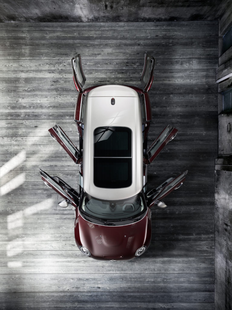
While working as a Senior UX Architect at Peppercomm, MINI had reached out for assistance in increasing awareness and engagement among media at a press event of the New York Auto Show. We were given a strict budget, a 10 day turn-time, and a vision provided by MINI that focused on two creative concepts – high-quality craftsmanship and the rich history of MINI. Below is what we produced.
Role: Dev Lead and Installation
Situation
Based on the information provided, we needed to create options that could be developed and executed very quickly and leverage pre-existing assets. MINI had communicated the availability of two 55″ touch monitors that could be used. Since we had two concepts to communicate, on such a limited timeline, this equipment availability presented some opportunities.
Not only could we activate two sensory touch-experiences at the event, but we could theoretically extend those experiences across other digital properties, most obviously within an event web app(s) and across social accounts.
MINI also opened up their entire photo library to us, to help with pulling both historical and current photographic assets.
Creative
Direction
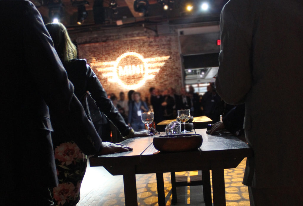
Although we didn’t have any optics on the physical space itself, we were told the area MINI would occupy would greet users upon entering the building, with two MINI vehicles placed in the center of the room without any other forms of digital screens or any other forms of content for the press. Therefore, having two 55″ touchscreens available to us, the intent was to create hubs of content that were very easily accessible that included additional information, which mirrored the vehicles on the floor.
Timeline
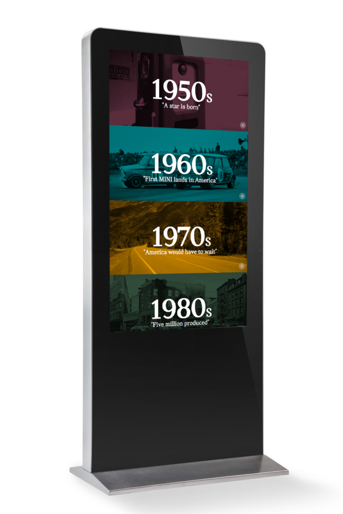
The timeline featured content from MINI throughout the years, starting with their 1950’s introduction into the marketplace. Users would be able to touch various years through brand-colored sections, which would reveal a breakdown of the years and supporting photos. In an effort to encourage engagement, the timeline would autoscroll up and down after a delay of not being touched.
MINI Interactive Timeline Web App
Craftsmanship
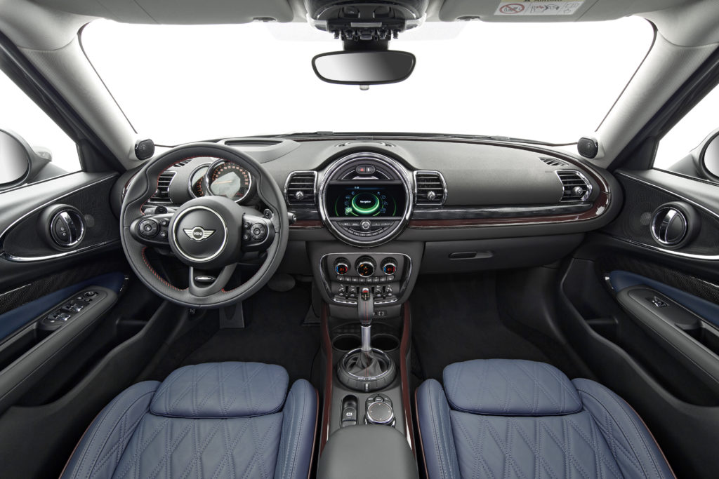
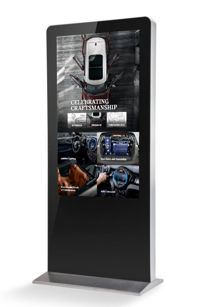
The craftsmanship display featured content about the MINI, with deep dives into the specific details about the vehicle from the stitching of the upholstery, to the shape of the headlights, to the tuning of the engine. The idea was to give quick-access to various areas of the vehicle, to provide a deeper level of understanding of MINI’s stance of quality and precision.
MINI Craftsmanship Web App
Installation and Result
The day of the event, my project manager and producer on the project, Jackie DiMauro, assisted in the installation and final QA measures to ensure the experience would be without friction. Unfortunately, due to a 10 day turn-time, some minor bugs were found upon initial setup. Additional, the touchscreens had to be mounted higher than in our preliminary tests. However, on location we were able to resolve the few bugs and lowered certain touch elements to ensure the interactivity would be accessible to visitors of any height.
Dozens of attendees interacted with the screens and we were able to glean some important insights of how the applications could be further improved.
After the event, MINI asked that we modify the applications into responsive web apps, so that the experience could be extended across other digital properties and throughout social.
Engage and interact with your audience.
Shoot me an email and tell me your ideas! Where there’s a will – there’s definitely a way. caleb@freemanhelp.com


