Overview
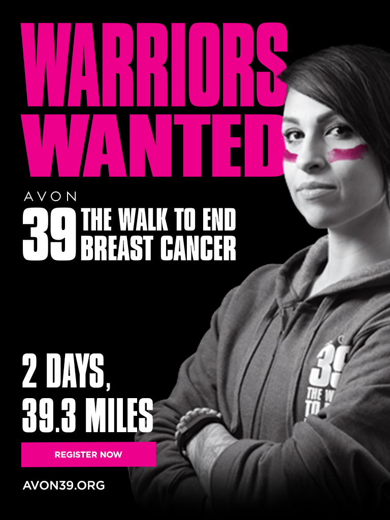
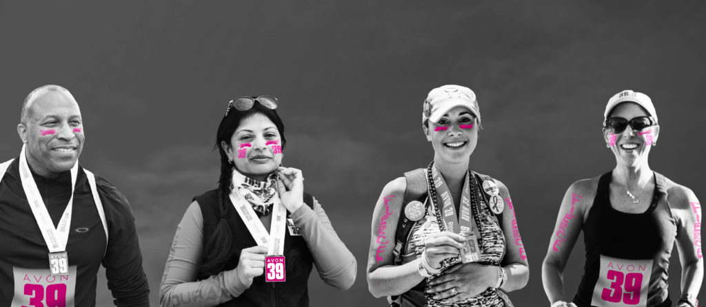
AVON39, an event part of the AVON Breast Cancer Crusade, was a 39.3 mile walk held in seven cities across the United States. While at Peppercomm, we were contacted to help counteract a declining registration trend, affecting many non-profit organizations at the time.
The organization ended up contracting with Peppercomm as agency of record, where the agency was providing services ranging from social activation and PR/comms to media buying and interactive development. We were able to stabilize registration numbers while increasing the lead database by over 300%.
Role: Experience Lead and Lead Developer
Digital
Experience
My part of the initiative began with a digital audit, which consisted of a deep dive into their donor journey, web analytics, donor analytics and nuances, marketing activities and behaviors and analysis of their registration flow.
The focus of my work was to create a new experience once user arrive at the website. My charge was to lead users from the campaign down the registration funnel in the most efficient and effective way possible.
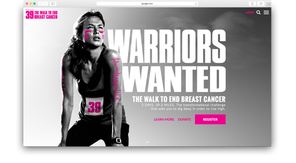
A quicker, more engaging user flow.
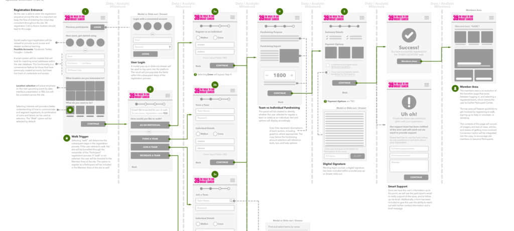
While updating the experience of the website, I was simultaneously evaluating the most efficient and effectively path to conversion. Using registration engagement analytics, I was able to map out an optimized user flow. Below is a portion of the end product user flow that led to the redesign and development of the critical path of registration.
Localization
As the event and campaign spanned the United States, it was important to contextualize the experience for the seven cities.
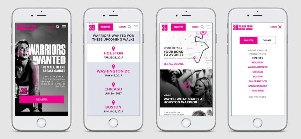
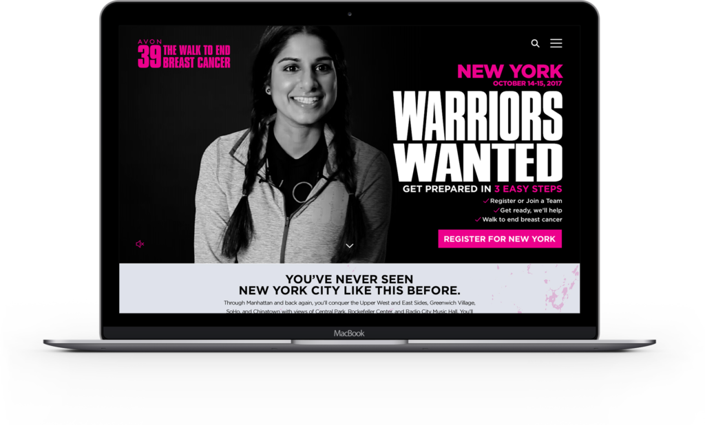
Location-based campaign landing pages were created that housed all information and details about the walk, as it related to those cities. These pages featured personalization from the location and copy to the imagery that was used. All landing pages were hyper-localized to the market with which we were engaging.
Registration
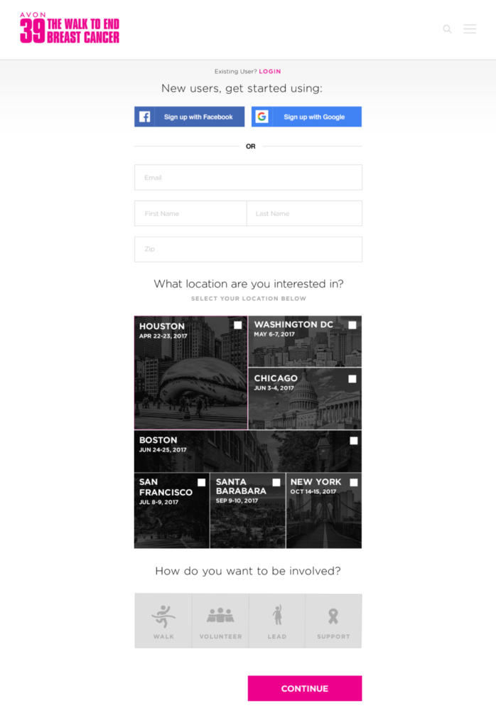
The final update was to deploy an updated, optimized registration flow. The new registration process followed the flow map previous shows, but incorporated the new brand aesthetic throughout.
Within the image to the right, based on locale/region of the user, the events would appear either with the large block the city of the user or based on chronological order for the next upcoming event.
This, along with all other creative output, helped us stabilize registration sign-ups at a time when all non-profit event registrations were dropping consistently.
Looking to achieve your goals?
From optimizing conversion paths to activating new brand experiences, ever idea has its own challenges and triumphs. Shoot me an email and tell me what you are looking to achieve – caleb@freemanhelp.com.


